Track Your Dream
Redesigning how Porsche owners experience waiting
Project
My Porsche (Track Your Dream)
Timeline
2024 Q2 - 2025 Q1
Key Contributions
Experience strategy, interaction design, user research, cross-platform consistency
Team
1 Product Owner 2 iOS Developers 2 Android Developers 5 Backend Developers 1 Business Analyst 1 Product Designer (Me) & other relevant stakeholders.

My Role
Solo designer across 2 phases
I was the only designer on Track Your Dream, responsible for both the mobile transition and the subsequent redesign initiative.
What I owned
Phase 1: Mobile Transition Led the shift from web to mobile. Redesigned the journey flow, introduced share feature, optimized media for mobile engagement.
Phase 2: Stage-Aware Redesign Defined the stage-aware framework. Designed milestone feed, card system, and adaptive map integration.
User Research Partnered with research team across both phases. Phase 2 included 2 rounds with 50+ participants and 6 Porsche owners in the US.
What I did
Discovery & Analysis Reviewed existing experience. Identified pain points through user feedback, analytics, and support tickets.
Design & Prototyping Created user flows, wireframes, and high-fidelity prototypes in Figma. Built interactive prototypes for testing.
Stakeholder Alignment Presented rationale to Porsche stakeholders. Gained approval for both phases.
Before & After

Before
Web-based tracker with landscape images, external video links, and static map shown at all stages. No mobile optimization. No sense of journey progression.

After (Phase 1)
Mobile-first experience with vertical videos, share feature, and clearer journey stages. Shipped.
After (Phase 2)
Stage-aware system that adapts content based on production, transport, and delivery phases. Validated, pending implementation.
Context
Waiting for a Porsche should feel like part of the experience.
Ordering a Porsche is a significant moment. Owners wait months, sometimes over a year, for their car to be built and delivered.
Porsche decided to discontinue the web version and shift entirely to mobile, where engagement was growing. But this wasn't just a platform migration. It was an opportunity to rethink the entire tracking experience.
The existing design treated tracking as a utility. But for Porsche owners, waiting is emotional. The experience needed to reflect that.
The Real Problem
One static experience for many different moments.
The original Track Your Dream showed the same interface regardless of where the car was in its journey.
During production, users saw a map with no movement. No storytelling. Progress felt invisible.
During transport, the map finally mattered, but it competed with irrelevant content.
At delivery, no special treatment for the final moment.
Users checked the app, saw nothing new, and stopped coming back. The design didn't adapt to their changing needs.
Constraints
Designing within platform and business realities
Constraint #1
Platform shift
Web was being discontinued. The entire experience needed to work on mobile.
Constraint #2
Content availability
Some milestones had rich content. Others had minimal data. The design needed to work with both.
Constraint #3
Phased approach
Budget was uncertain. Phase 1 focused on quick wins. Phase 2 was a deeper redesign that might not ship immediately.
Core Insight
Anticipation needs different things at different times.
Early waiting is emotional.
Users need signs of life, progress, and something to look forward to.
Late waiting is practical. Users need precision, timing, and confidence.
The insight: design for the phase, not just the feature.
"I keep checking, but nothing ever changes."
"I just want to know my car is being built. Show me something."
"When it's finally on the truck, I want to see exactly where it is."
Reframing
From:
"How do we move tracking to mobile?"
To:
"How do we design an experience that evolves with the owner's journey?"
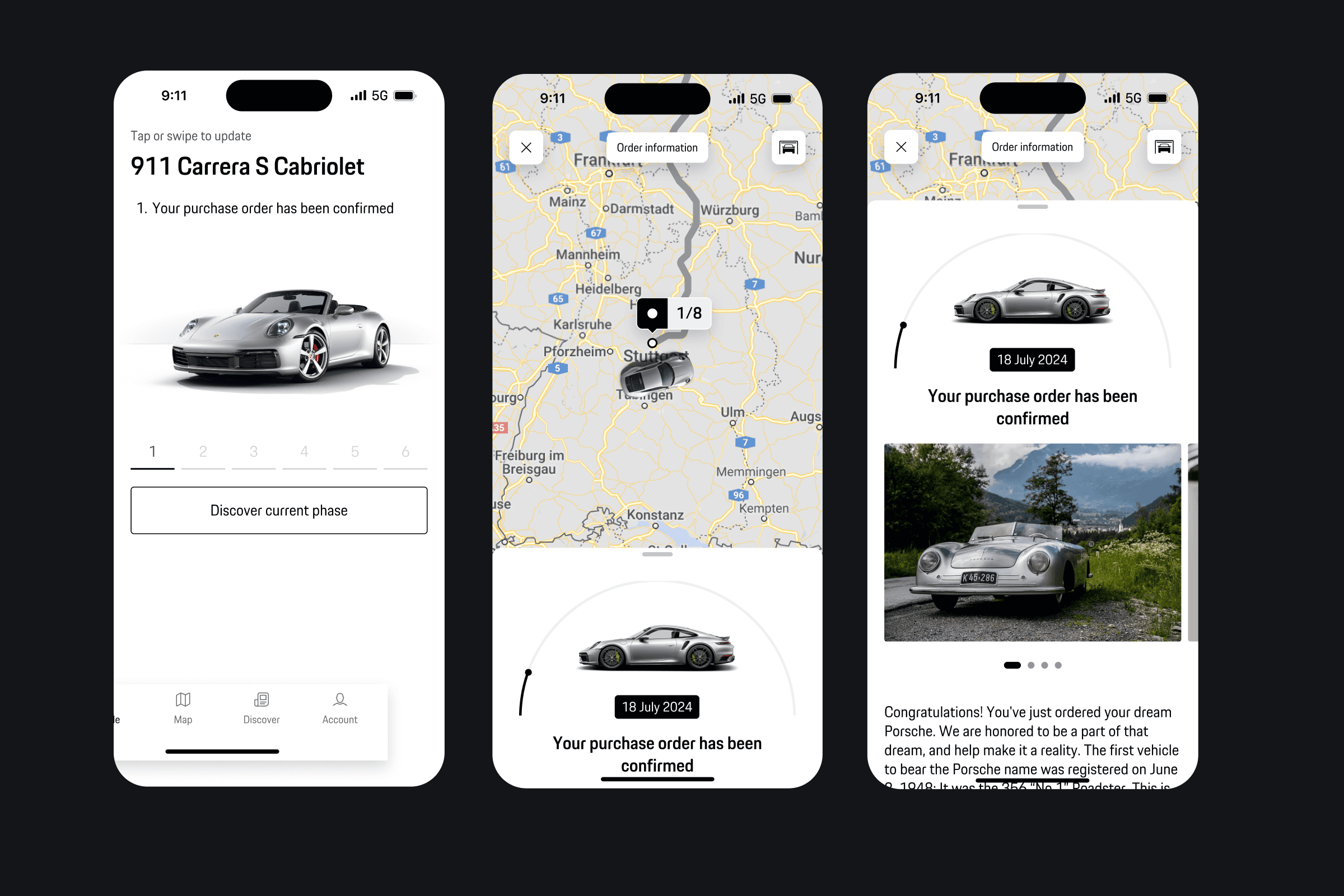
Phase 1: Mobile Transition
From desktop utility to mobile-first experience


Turning anticipation into connection
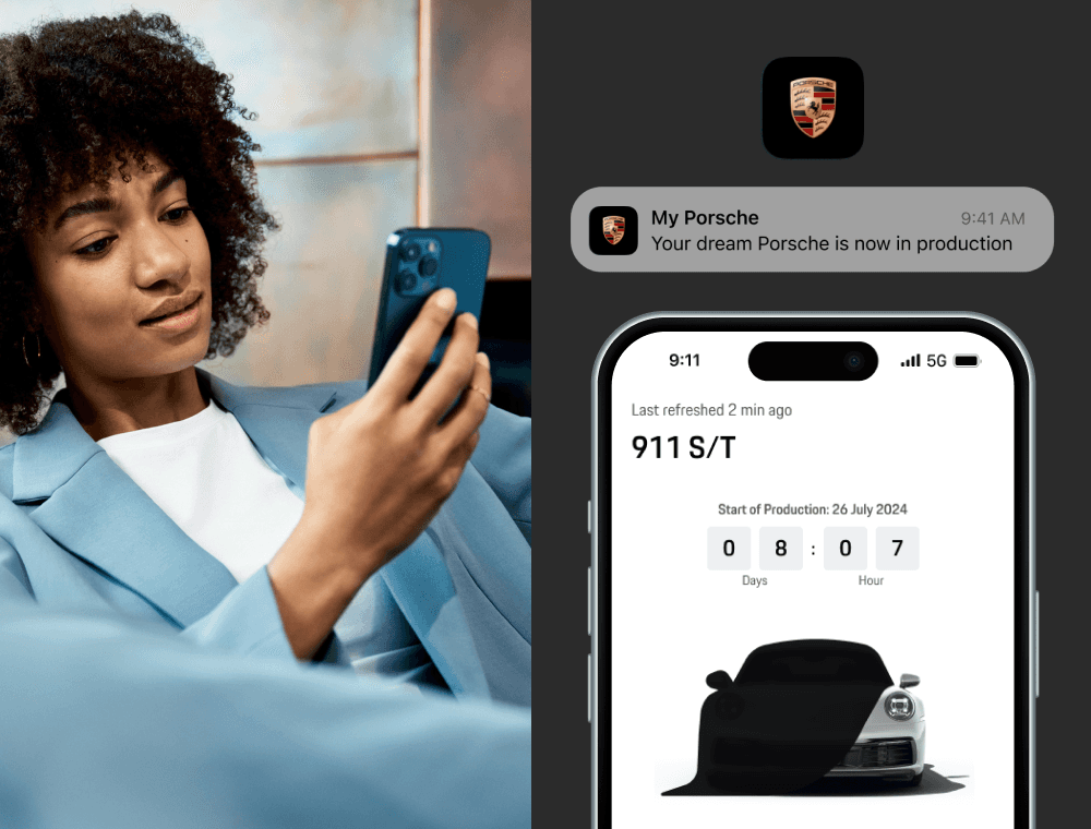
Many customers screenshot their configured Porsche and use it as wallpaper. We turned this behavior into a feature. Vehicle data generates personalized wallpapers automatically. 170+ paint codes, 3 visual styles, all rendered on-demand.
Phase 1 Impact
Quantitative metrics:
~40% increase
in task completion rate
+60% increase
in video click-through rate
+55% increase
in wallpaper feature engagement
Qualitative outcomes:
Clearer journey flow. Stronger emotional connection. System consistency across Porsche's design system.
Phase 2: Stage-Aware Redesign
Taking the vision further
Phase 1 improved the experience, but didn't solve the fundamental problem:
the design still showed the same interface at all stages.
Phase 2 reimagined tracking as a stage-aware journey. Different content, different emphasis, different interactions based on where the car is.
Validated through user research. Approved by stakeholders. Paused due to budget restructuring.
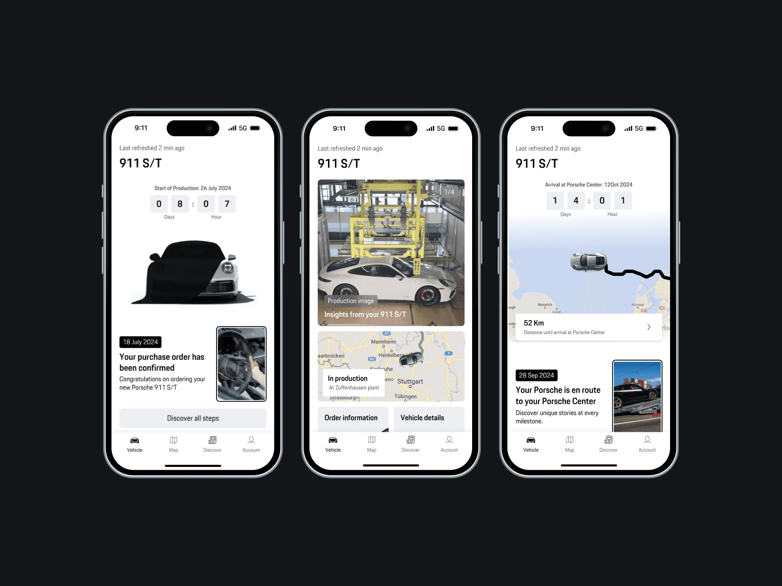
Showing What Matters, When It Matters
The journey begins before the car moves. Early stages focus on reassurance and signs of progress, not a map. The interface leads with story and visual cues, then brings the map forward only when movement becomes meaningful.

Card Layout That Changes With Each Stage
The milestone feed becomes a narrative structure. Each card expands with visuals or details depending on the phase. During production it feels expressive. During transport it becomes precise.

Replacing Text With Emotion
Production is a long, quiet wait. Short-form videos and factory imagery make progress feel real and turn updates into moments worth returning to.
Dividing Map and Content for Clarity
The new design separates responsibilities. The feed carries story and progression. The map focuses on movement and timing. Each appears only when it adds clarity.

Validation
Why the redesigned experience worked
Two research rounds were conducted with more than 50 participants and 6 Porsche owners in the US. Results showed consistent improvements in clarity, emotional engagement, and ease of understanding.
Metric #1 Smarter Use of the Map
Users appreciated that the map appeared only when the car began transport. This change reduced unnecessary interactions by nearly 40% during the production stage.
Metric #2 Clearer Progress
92% of participants reported that the new milestone feed made progress easier to understand. The countdown and modular structure provided a stronger sense of movement.
Metric #3 Stronger Emotional Connection
86% responded positively to short-form video content and production imagery. Participants described the experience as "more personal," "alive," and "worth checking again."
Metric #4 Stakeholder Alignment
Both user groups preferred the redesigned flow. After reviewing testing outcomes, Porsche stakeholders approved this direction for roadmap integration.
The redesigned concept was validated and approved but implementation was paused due to budget restructuring.